SFDIFY

A high-converting website is built from six visible layers working together: a clear value proposition above the fold, a fast-loading first impression, a visible and specific call-to-action, trust signals near the decision point, a frictionless path to contact or checkout, and mobile-first layout. Miss any one of these and visitors bounce before they convert — the BBC found it lost an additional 10% of users for every additional second its site took to load [1]. Get all six right and the same traffic converts at a noticeably higher rate without spending a dollar more on ads: a Google-commissioned Deloitte study found a 0.1-second improvement in mobile site speed increased conversion rates by 8.4% for retail sites [2].
- In a Google-commissioned Deloitte study, a 0.1-second mobile speed gain lifted conversion rates 8.4% for retail sites and 10.1% for travel sites [2] — design and speed are conversion factors, not just aesthetics.
- Users often leave web pages within 10–20 seconds, according to Nielsen Norman Group [3], so everything above the fold has to earn the scroll.
- A call-to-action that names the specific next step ("Get a Free Quote," not "Learn More") works better than vague phrasing because it removes ambiguity about what happens next; Nielsen Norman Group advises stating precisely what users should expect [4].
- Trust signals — reviews, certifications, client logos — work best when placed right next to the decision point, not buried in a separate page.
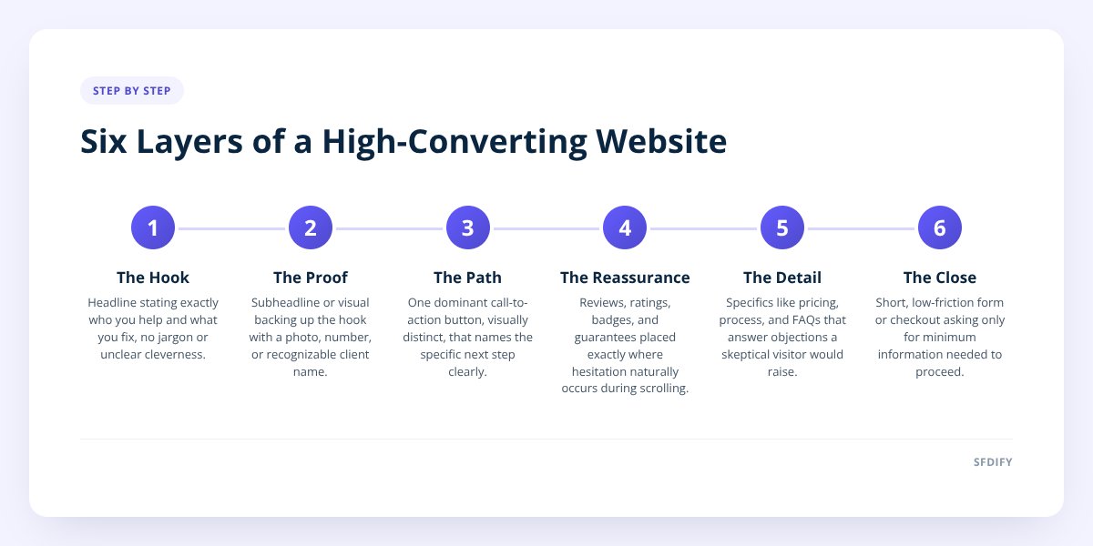
The Six Layers of a Converting Page, Top to Bottom
Think of a webpage like a building: each floor has to hold up the one above it, or the whole structure feels shaky. Here's the sequence, in the order a visitor actually experiences it.
- Layer 1 — The Hook (0–3 seconds): A headline that states exactly who you help and what you fix, no jargon, no cleverness that obscures meaning.
- Layer 2 — The Proof (3–10 seconds): A subheadline or visual that backs up the hook — a photo of real work, a specific number, a recognizable client name.
- Layer 3 — The Path (10–20 seconds): One dominant call-to-action button, visually distinct from everything else on the page, doing one job.
- Layer 4 — The Reassurance (scroll zone): Reviews, star ratings, security badges, or guarantees placed exactly where hesitation naturally shows up.
- Layer 5 — The Detail (mid-page): Enough specifics — pricing, process, FAQs — to answer the objections a skeptical visitor would raise silently.
- Layer 6 — The Close (footer and forms): A short, low-friction form or checkout flow that asks for the minimum information needed to move forward.
Each layer either earns the visitor's trust to keep scrolling or gives them a reason to leave. A site can nail Layer 1 with a gorgeous headline and still lose the visitor at Layer 6 if the contact form asks for twelve fields nobody wants to fill out. Baymard Institute found the average checkout flow contains 11.3 form fields, while most sites need only 8 [6].
Why Does the "Above the Fold" Section Matter So Much?
The above-the-fold section — everything visible before a visitor scrolls — matters because it's the only part of your site every single visitor sees, whether they stay or not. In Nielsen Norman Group's eye-tracking research, users spent about 57% of their page-viewing time above the fold [5]. If the headline is vague, if the layout is cluttered, or if the page takes too long to render, the rest of your carefully built site never gets seen.
A strong above-the-fold section usually contains:
- One headline stating the specific outcome you deliver.
- One supporting line of proof (a stat, a client type, a guarantee).
- One visual that reinforces the message, not just fills space.
- One clear button that tells the visitor exactly what to do next.
Businesses often redesign a site because it "looks dated," but the real problem is frequently that the top of the homepage tries to say five things at once and ends up saying nothing clearly. We cover the broader warning signs in 10 Signs Your Website Needs a Redesign, but slow load time and a cluttered hero section are two of the most common culprits.
Where Should Trust Signals Actually Go?
Trust signals convert best when they sit directly next to the decision the visitor is about to make, not on a separate "About Us" or "Testimonials" page. A visitor hesitating over a $2,000 service quote wants to see a review right next to the price, not three clicks away.
Here's a simple comparison of trust-signal placement and its typical effect on visitor confidence:
| Placement | Visitor Behavior | Effect on Conversion |
|---|---|---|
| Separate testimonials page | Visitor must actively seek it out | Rarely seen; low impact |
| Footer only | Seen only by visitors who scroll to the bottom | Minimal impact |
| Next to the CTA button | Seen at the exact moment of hesitation | Highest impact |
| Inline with pricing/service details | Answers objections as they form | Strong impact |
The pattern holds across industries: proof works when it's positioned at the friction point, not archived somewhere else on the site.
if your call-to-action button and your strongest piece of proof (review, guarantee, or result) are more than one scroll apart, you are very likely losing conversions you'd otherwise keep.
What Actually Makes a Call-to-Action "High-Converting"?
A high-converting call-to-action names the specific action and the specific benefit, rather than using generic filler language. "Submit" tells a visitor nothing. "Get My Free Website Audit" tells them exactly what happens when they click.
A few properties separate a strong CTA from a weak one:
- Specificity: It names the exact next step, not a vague action.
- Visual contrast: It uses a color and size that stand out from every other element on the page.
- Singular focus: One primary CTA per section — competing buttons split attention and lower the click rate on both.
- Proximity to proof: It sits near a trust signal, not isolated on an empty background.
- Low-friction language: "Get a Free Quote" reduces perceived risk more than "Buy Now" for a service that requires a conversation first.
Businesses frequently discover, after a redesign, that changing button copy and placement moves conversion numbers more than a full visual overhaul does. Design carries the visitor to the button — but the button itself still has to close the deal.
How Does Site Speed Fit Into "Design"?
Site speed is part of design, not a separate technical concern, because a visually perfect page that loads slowly never gets seen by most visitors. Google's web.dev performance guidance cites the BBC losing an additional 10% of users for every additional second of load time [1], meaning a beautiful homepage that takes six seconds to render is functionally invisible to a large share of its audience.
This is where design and development responsibilities overlap. A designer can build a stunning layout, but if it's not built with performance in mind — optimized images, minimal render-blocking scripts, a competent hosting setup — the conversion anatomy above falls apart before a visitor ever reaches Layer 3. We go deeper into this relationship in Why Website Performance Affects App Development Costs and Timelines, since the same performance principles that affect conversion also affect what a website or app costs to build and maintain.
A quick self-check for site owners:
- Test your homepage load time on a mobile connection, not just office wifi.
- Check whether your largest images are compressed before upload.
- Confirm your CTA button is visible without scrolling on a phone screen.
- Verify your contact form has no more than 4–5 fields.
- Look at your top three competitors' homepages and time how long each takes to load.
Mobile Layout Isn't a Smaller Version of Desktop
A mobile-first layout means the site was designed for a phone screen first and scaled up, not the other way around — and this changes decisions at every layer described above. On mobile, the fold is much shorter, so the hook and CTA have to work in a tighter space with less room for a long headline or a busy hero image.
Common mobile-specific mistakes that quietly break the conversion anatomy:
- Buttons sized for a mouse cursor instead of a thumb.
- Forms that require zooming in to read field labels.
- Navigation menus that hide the CTA behind a hamburger icon — Nielsen Norman Group found content discoverability was significantly lower when navigation was hidden, on both mobile and desktop [7].
- Text that's legible on desktop but shrinks below comfortable reading size on a phone.
Since mobile devices now account for about 60% of worldwide web traffic (59.9% in StatCounter's latest data) [8], treating mobile as an afterthought effectively breaks the highest-traffic version of the page. If you're planning a rebuild and want to understand what that process actually involves, How Long Does It Take to Build a Website? A Phase-by-Phase Timeline walks through each stage from planning to launch.
Putting the Anatomy Together
None of these six layers works in isolation — a fast-loading page with a weak headline still loses visitors, and a great headline on a slow page never gets read. The businesses that see the strongest results treat design, speed, copy, and mobile layout as one connected system rather than separate checkboxes handled by different people at different times.
If you're evaluating whether to fix your current site or start over, that decision usually comes down to how many of these six layers are actually broken versus just outdated. A single missing trust signal is a quick fix. A slow, cluttered, desktop-only layout is a rebuild.
SFDIFY works with businesses on website design and development, from targeted redesigns that fix specific conversion gaps to full custom builds. If you're not sure which layer of your site is costing you visitors, reach out and we'll walk through it with you.
Sources
- Why speed matters | web.dev — checked 2026-11-08
- Milliseconds make millions | web.dev — checked 2026-11-08
- How Long Do Users Stay on Web Pages? | Nielsen Norman Group — checked 2026-11-08
- "Get Started" Stops Users | Nielsen Norman Group — checked 2026-11-08
- Scrolling and Attention | Nielsen Norman Group — checked 2026-11-08
- Checkout Optimization: 5 Ways to Minimize Form Fields in Checkout | Baymard Institute — checked 2026-11-08
- Hamburger Menus and Hidden Navigation Hurt UX Metrics | Nielsen Norman Group — checked 2026-11-08
- Desktop vs Mobile vs Tablet Market Share Worldwide | Statcounter Global Stats — checked 2026-11-08
How SFDIFY can help: SFDIFY designs and builds websites, web apps and custom software for growing businesses, and the first consultation is free. See all SFDIFY services.